

Das Thema fand ich faszinierend!
Daher habe ich mich mal daran getraut und "mein" Skript etwas umgebaut!
Was das "neue" Skript macht.
- Button-Anlage: Erzeugt den Button in der Firefox-Navigationsleiste.
- Startup-Observer: Wartet, bis Firefox nach dem Start wirklich bereit ist.
- Tab-Öffnung: Öffnet about:addons in einem neuen Tab.
- DOM-Wartefunktion: Prüft wiederholt, ob die Add-ons-Oberfläche geladen ist.
- Update-Klicks: Klickt dann die passenden Einträge in der Oberfläche an, damit Updates sichtbar werden.
- Button-Handler: Macht denselben Ablauf manuell per Klick.
Und wie immer der Hinweis, dass da KI die Finger im Spiel hatte!
Dieses Mal ist perplexity.ai an allem Schuld.
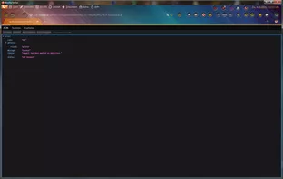
Und hier das Skript für alle, die es ausprobieren und testen wollen.
JavaScript
// Atomatk-Addons-UpDate-Check.uc.js
// Das Script führt automatisch einen UpDate-Check aus und dies in einem neuen Tab anzeigt.
// Auch wird ein Button erstellt, der einen UpDate-Check ausführt und dies in einem neuen Tab anzeigt.

// Source file https://www.camp-firefox.de/forum/thema/xxxxxx/?postID=xxxxxxx#postxxxxxxx

/* ----------------------------------------------------------------------------------- */
/*     Zu beachten ist, dass die Grafiken sich im richtigen Ordner befinden müssen     */
/*            %appdata%\Mozilla\Firefox\Profiles\"Profilname"\chrome\icons             */
/* ----------------------------------------------------------------------------------- */

(function() {
  "use strict";

  // Nur in einem normalen Browserfenster weiterarbeiten.
  if (!window.gBrowser) return;

  // Interne ID des Buttons in der Firefox-Oberfläche.
  const id = "addons-update-button";

  // Zielseite, die geöffnet werden soll.
  const link = "about:addons";

  // Sichtbarer Text für den Button.
  const label = "Add-ons Update";

  // Tooltip beim Darüberfahren mit der Maus.
  const tooltiptext = "Add-ons aktualisieren";

  // Dateiname des Icons.
  const icon = "sync.svg";

  // Pfad zum Icon innerhalb deines Profils.
  const iconPath = "/chrome/icons/";

  // Verzögerung nach Firefox-Start, damit die Oberfläche fertig geladen ist.
  const STARTUP_DELAY_MS = 2500;

  // Maximale Wartezeit darauf, dass about:addons vollständig geladen ist.
  const MAX_WAIT_MS = 12000;

  // Intervall für wiederholte Prüfungen.
  const POLL_MS = 250;

  // Profilpfad als URI, damit das Icon geladen werden kann.
  const curProfDir = PathUtils.toFileURI(PathUtils.join(PathUtils.profileDir));

  // Merkt sich, ob der Startvorgang schon einmal ausgeführt wurde.
  let startupDone = false;

  // Verhindert parallele Abläufe.
  let busy = false;

  // SVG-Icons können CSS-Farbangaben übernehmen; das schaltet Firefox dafür frei.
  if (Services.prefs.getBoolPref("svg.context-properties.content.enabled") === false) {
    Services.prefs.setBoolPref("svg.context-properties.content.enabled", true);
  }

  // Den Button in die Navigationsleiste einfügen.
  try {
    CustomizableUI.createWidget({
      id,
      defaultArea: CustomizableUI.AREA_NAVBAR,
      label,
      tooltiptext,
      onCreated: (button) => {
        // SVG soll Farbe und Kontur aus CSS übernehmen.
        button.style.MozContextProperties = "fill, stroke, fill-opacity";

        // Icon aus deinem Profilordner laden.
        button.style.listStyleImage = 'url("' + curProfDir + iconPath + icon + '")';

        // Breite nicht zu klein erzwingen.
        button.style.minWidth = "fit-content";

        // Icon-Farbe.
        button.style.color = "#ffe10f";
      }
    });
  } catch (e) {}

  // Liefert das aktuellste Browserfenster.
  function getBrowserWindow() {
    return Services.wm.getMostRecentWindow("navigator:browser");
  }

  // Öffnet about:addons in einem neuen Tab.
  function openAddonsTab(win) {
    if (!win) return false;
    try {
      win.openTrustedLinkIn(link, "tab");
      return true;
    } catch (e) {
      return false;
    }
  }

  // Prüft, ob die Update-Elemente in about:addons schon vorhanden sind.
  function runOriginalAddonActions(doc, win) {
    try {
      // Bereich für die Add-ons-Optionen.
      const options = doc.querySelector("addon-page-options");

      // Menüpunkt "Check for Updates".
      const checkItem = doc.querySelector('panel-item[action="check-for-updates"]');

      // Menüpunkt "View Recent Updates".
      const recentItem = doc.querySelector('panel-item[action="view-recent-updates"]');

      // Erst die Ansicht der letzten Updates öffnen.
      if (options && recentItem) {
        recentItem.click();
      }

      // Danach die Update-Prüfung auslösen.
      if (options && checkItem) {
        checkItem.click();
      }

      // Kurz warten, damit Firefox die Ergebnisse sichtbar aufbauen kann.
      win.setTimeout(function() {
        try {
          const categories = doc.getElementById("categories");

          if (categories) {
            // Kategorie "recent updates" anklicken.
            const recentBtn = categories.querySelector('button[viewid="addons://updates/recent"]');

            // Kategorie "available updates" anklicken.
            const availableBtn = categories.querySelector('button[viewid="addons://updates/available"]');

            if (recentBtn) recentBtn.click();
            if (availableBtn) availableBtn.click();
          }
        } catch (e) {}

        // Freigabe für neue Aktionen.
        busy = false;
      }, 1500);
    } catch (e) {
      busy = false;
    }
  }

  // Wartet, bis about:addons vollständig geladen ist.
  function waitForAboutAddons(win, fromStartup) {
    const started = Date.now();

    function tick() {
      let doc = null;

      try {
        doc = win.gBrowser.selectedBrowser.contentDocument;
      } catch (e) {}

      // Nur weitermachen, wenn about:addons wirklich geöffnet ist.
      if (doc && doc.URL === "about:addons") {
        try {
          // Prüfen, ob die erwarteten UI-Elemente schon vorhanden sind.
          const options = doc.querySelector("addon-page-options");
          const checkItem = doc.querySelector('panel-item[action="check-for-updates"]');
          const recentItem = doc.querySelector('panel-item[action="view-recent-updates"]');

          // Wenn alles da ist, die eigentliche Update-Logik starten.
          if (options && checkItem && recentItem) {
            runOriginalAddonActions(doc, win);
            return;
          }
        } catch (e) {}
      }

      // Weiter warten, solange das Zeitlimit nicht überschritten ist.
      if (Date.now() - started < MAX_WAIT_MS) {
        win.setTimeout(tick, POLL_MS);
      } else {
        // Wenn die Zeit abgelaufen ist, wieder freigeben.
        busy = false;

        // Beim Start nicht weiter forcieren.
        if (!fromStartup) {
          openAddonsTab(win);
        }
      }
    }

    tick();
  }

  // Gemeinsame Hauptfunktion für Start und Button.
  function runCheck(fromStartup) {
    if (busy) return;
    busy = true;

    const win = getBrowserWindow();
    if (!win) {
      busy = false;
      return;
    }

    // Erst Tab öffnen.
    if (!openAddonsTab(win)) {
      busy = false;
      return;
    }

    // Danach auf fertige Seite warten.
    waitForAboutAddons(win, fromStartup);
  }

  // Startprüfung nur einmal ausführen.
  function runStartupCheck() {
    if (startupDone) return;
    startupDone = true;

    const win = getBrowserWindow();
    if (!win) return;

    // Kleine Verzögerung, damit Firefox vollständig bereit ist.
    win.setTimeout(function() {
      runCheck(true);
    }, STARTUP_DELAY_MS);
  }

  // Observer für den Zeitpunkt, an dem Firefox die Fenster wiederhergestellt hat.
  function onWindowsRestored(subject, topic) {
    if (topic !== "sessionstore-windows-restored") return;

    try {
      Services.obs.removeObserver(onWindowsRestored, "sessionstore-windows-restored");
    } catch (e) {}

    runStartupCheck();
  }

  // Observer registrieren.
  try {
    Services.obs.addObserver(onWindowsRestored, "sessionstore-windows-restored");
  } catch (e) {
    // Falls der Observer nicht verfügbar ist, per Timer versuchen.
    window.setTimeout(runStartupCheck, STARTUP_DELAY_MS);
  }

  // Button-Klick-Handler einrichten.
  (function click_button() {
    const button = document.getElementById(id);

    if (button) {
      button.addEventListener("click", (event) => {
        // Nur linker Mausklick.
        if (event.button !== 0) return;

        // Das richtige Browserfenster ermitteln.
        const win = event.target.documentGlobal || event.target.ownerGlobal;

        // Keine parallelen Läufe.
        if (busy) return;

        busy = true;

        // Verhalten wie beim Start: Tab öffnen und dann prüfen.
        if (!openAddonsTab(win)) {
          busy = false;
          return;
        }

        waitForAboutAddons(win, false);
      });
    } else {
      // Wenn der Button noch nicht existiert, erneut probieren.
      setTimeout(click_button, 100);
    }
  })();

})();